I designed a website for CU Boulder’s pre-health program. While I also created the site’s layout and navigation, this post focuses on UX writing.
CHALLENGE
Give students interested in health careers enough information that they apply to the program.
SOLUTION
Describe the program benefits and application process in clear, simple terms.
HOW I HELPED
- Collaborated with program director to articulate goals and align on key messages.
- Developed new copy and edited existing for clarity and tone of voice.
- Designed the site’s layout and navigation.
TEAM
Dana Parcher
Pre-health director and content expert
Tim Grassley
UX and design
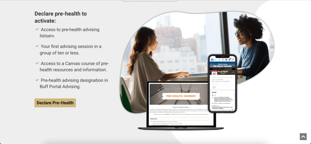
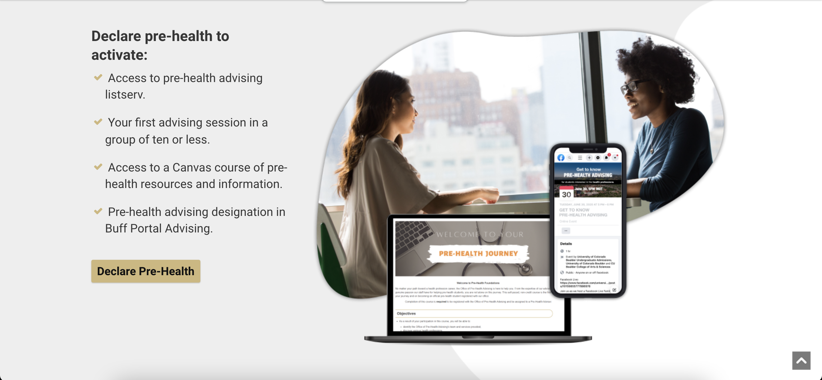
PROGRAM BENEFITS
The original copy offered abstract benefits that were difficult to quickly imagine (e.g., “resources” and “help.”). It was also unclear what users should do with the information. I added four concrete benefits listed as bullets, and finished the block with a button whose call to action gave more weight to the program.
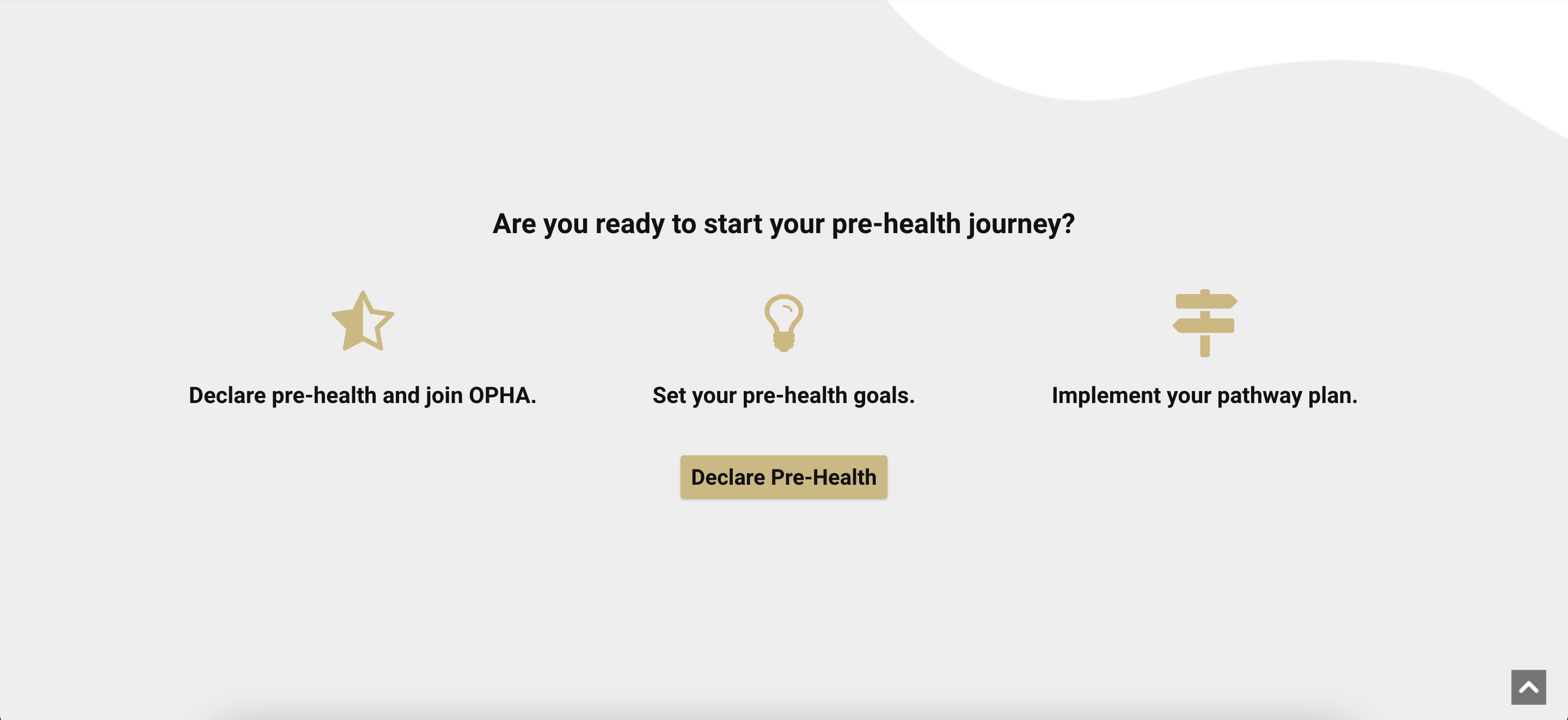
ENROLLMENT PROCESS
As students participate in the pre-health program, they open more benefits. We tried out several ways to present this information and decided it to gradually introduce it. The homepage’s use, then, could focus on making the enrollment process appear simple and seamless with short copy and a descriptive call-to-action.
PREPARE PAGE
The site houses a page with tips and resources that help students prepare to be competitive applicants. While the written content is strong, there is a lot of it and little could be cut.
I shifted the page layout into something closer to an online guide. I grouped paragraph copy into three sections with uneven visual breaks that kept scrolling momentum. Most importantly, I added a descriptive header with an inviting call-to-action meant to encourage sign-ups.