To better connect students to advisors and online help materials, we overhauled the advising center’s website using UX research to guide our design decisions.
About the project
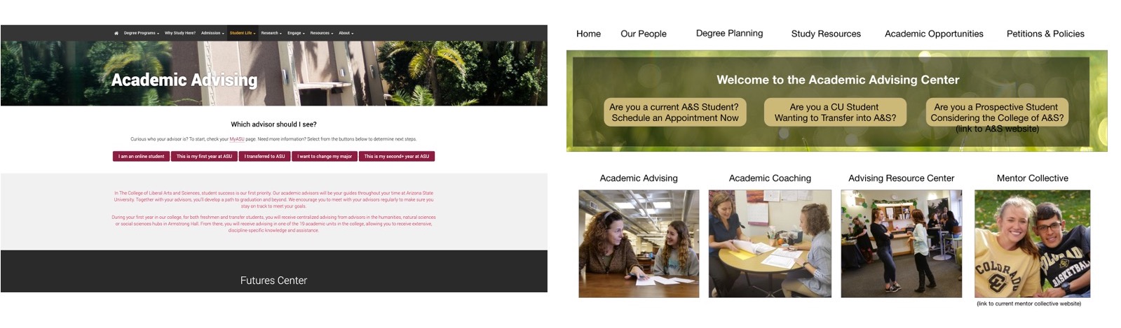
The Academic Advising Center (AAC) asked our team to overhaul their website so that it generated organic awareness of the AAC’s work and resources. Using task analyses, card sorts, focus group tests and A/B tests, our team made significant changes to the layout, design system, menu titles and content. We also recommended strategies to generate new content and improve the likelihood their site would show up high in organic search results.

UX Challenges
In our first meeting with the AAC’s leadership team, we asked them to summarize who they hoped would use the website and how. They expressed interest in a variety of audiences with wide ranging needs and more than 100 tasks they hoped audiences could accomplish. The AAC’s previous websites struggled to find cohesive categories and consistent naming systems to make content quickly findable without search.
The AAC previously marketed itself as a “one-stop shop” for academic resources, degree planning and coaching, and their staff members are skilled at helping students and faculty navigate the very large ecosystem of websites under CU Boulder. However, they generated articles meant to explain or connect users to policies or programs that were not “owned” by the AAC and became inaccurate once the owner changed the policy or program. We needed to ensure our pages, photos and files were unduplicated, unit-specific and fully accessible for every visitor to the site.
Solutions
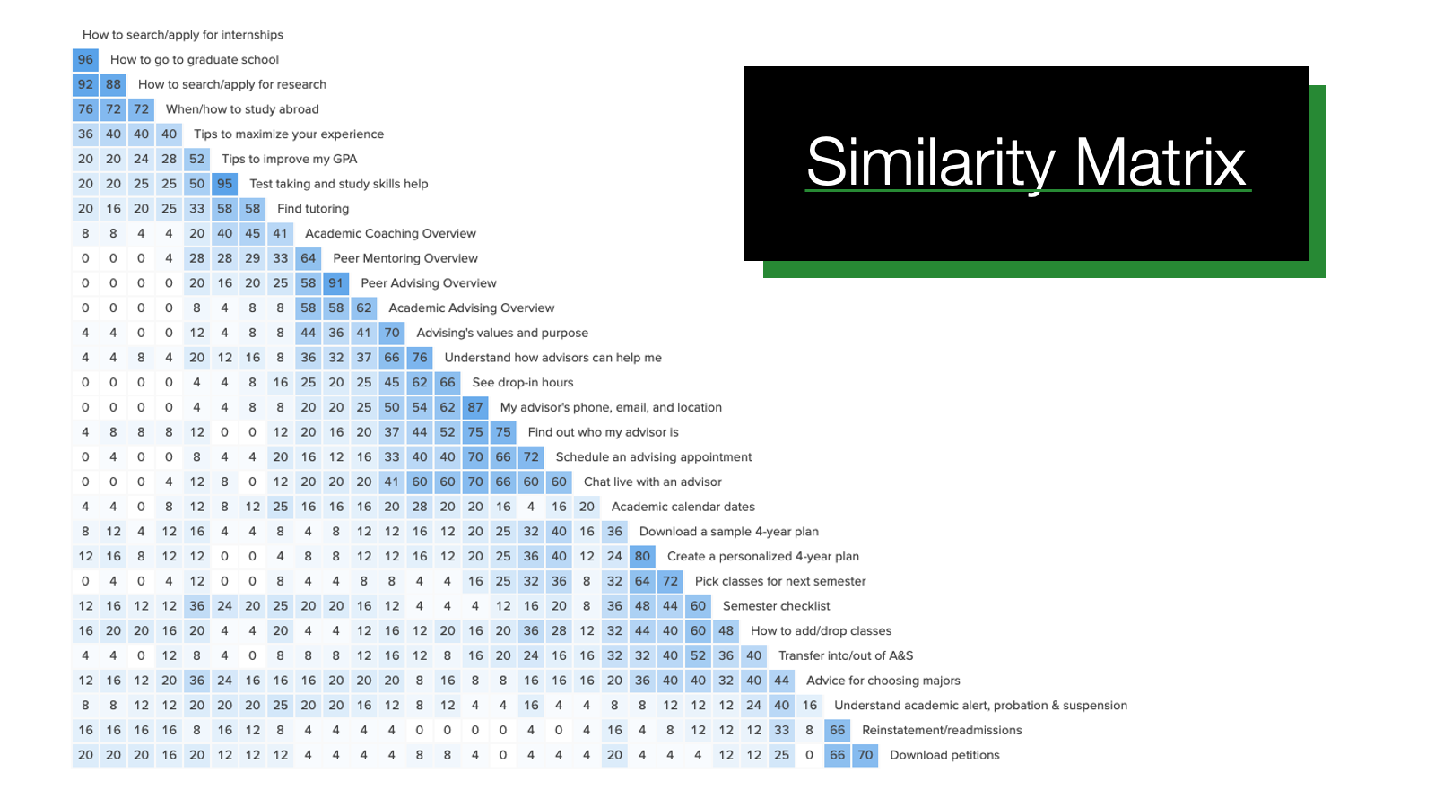
Our team agreed to depend on data from user studies to inform our information architecture and naming conventions. We also committed to keeping each task within two or three clicks of the homepage. Our first two studies, a top task analysis and open card sort, helped us understand users’ priorities and the way they categorized the tasks. This data gave us ideas for content names, which we vetted through a closed card sort. In closed card sorts, users are given the original 100 tasks for the site, and they drop them into five pre-named buckets. This study revealed several problem content areas, which we incorporated into our design.
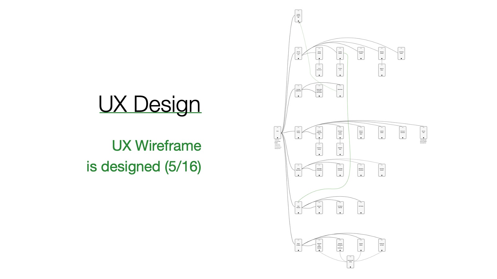
With our information architecture in hand, we developed an interactive prototype using Adobe XD. The prototype gave us opportunities to run a variety of tests that helped us understand the effect of our layouts on users experiences, including snap tests, use studies, side-by-side comparisons with competitors’ sites, semantic differential surveys (i.e., a series of yes/no questions focused on the users’ responses to given pages) and A/B tests (e.g., in which we test users’ preferences for one layout against another).
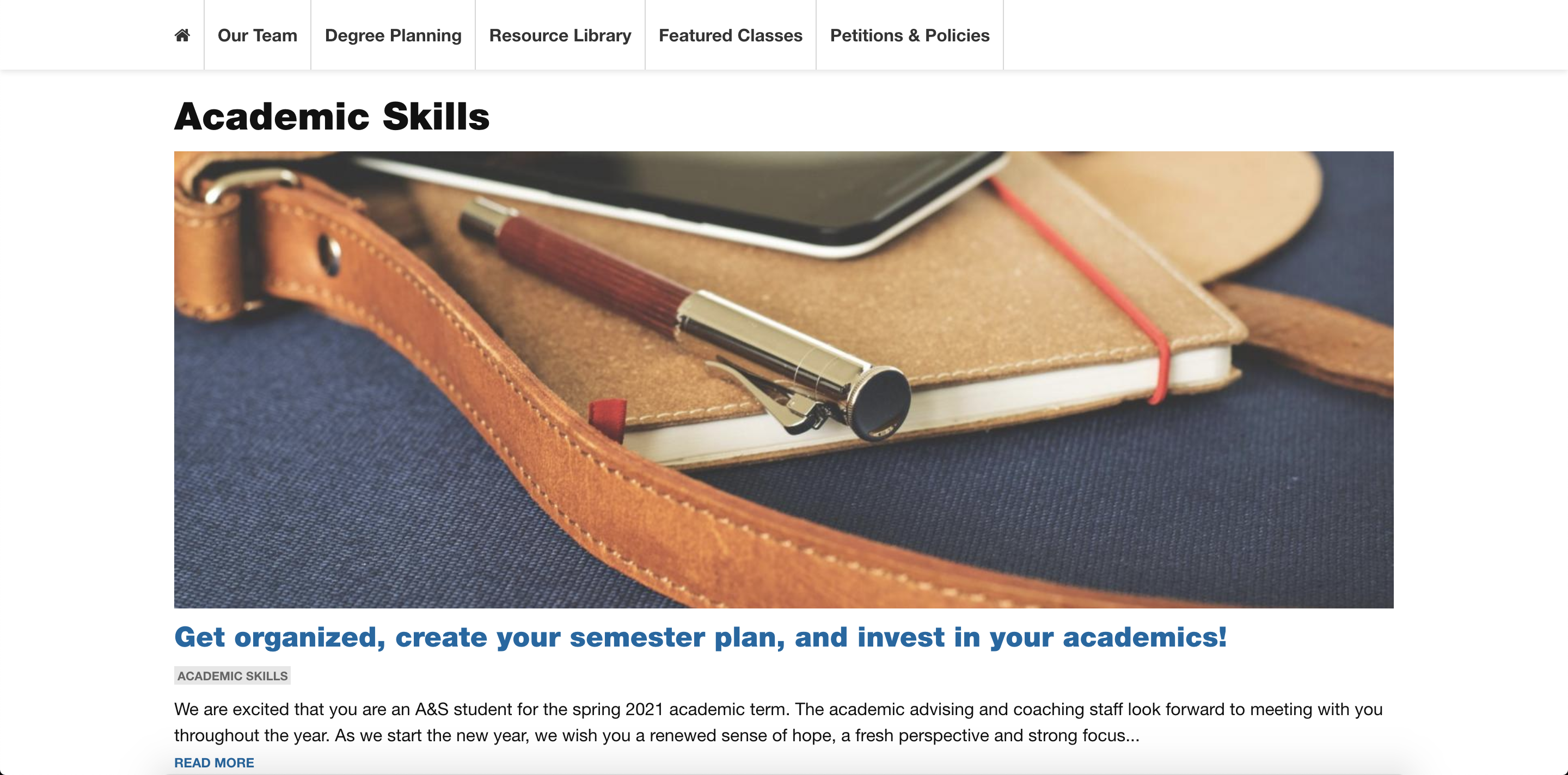
We were able to launch the revamped site early and test its functionality throughout the summer, when advising’s online traffic is lower. With a few optimizations made based on Google analytics, we more than tripled traffic within the first month, from 500 daily, unique visitors to 1,600. The site also typically lands within the first three search results for several keywords. At launch, our team recommended the AAC develop articles to keep the site’s content fresh and continue to grow organic traffic. In summer 2020, we helped them write, edit and post articles in a new Resource Library, which has continued to grow their audiences.
The Team
Tim Grassley
Project Manager/Creative Director
Kate Feldman
Project Lead, Layout
Kim Noice
Project Lead, Content
Allison Frey
Content Author
Mara Vahratian
Content Author
Greer McKeown
Content Author
Aishwarya Krishnamoorthy
Project Lead, UX
Adam Dane
Content Author
Lauren Brown
Content Author
Kelsey Clark
Content Author
